[ Work ]
Designed to be
remembered.
Fifteen concept projects created by Webvetra to show our range. Every one designed from a blank page, with a reason behind every choice. Hover a design to scroll through it.
[ 01 / AI analytics platform ]
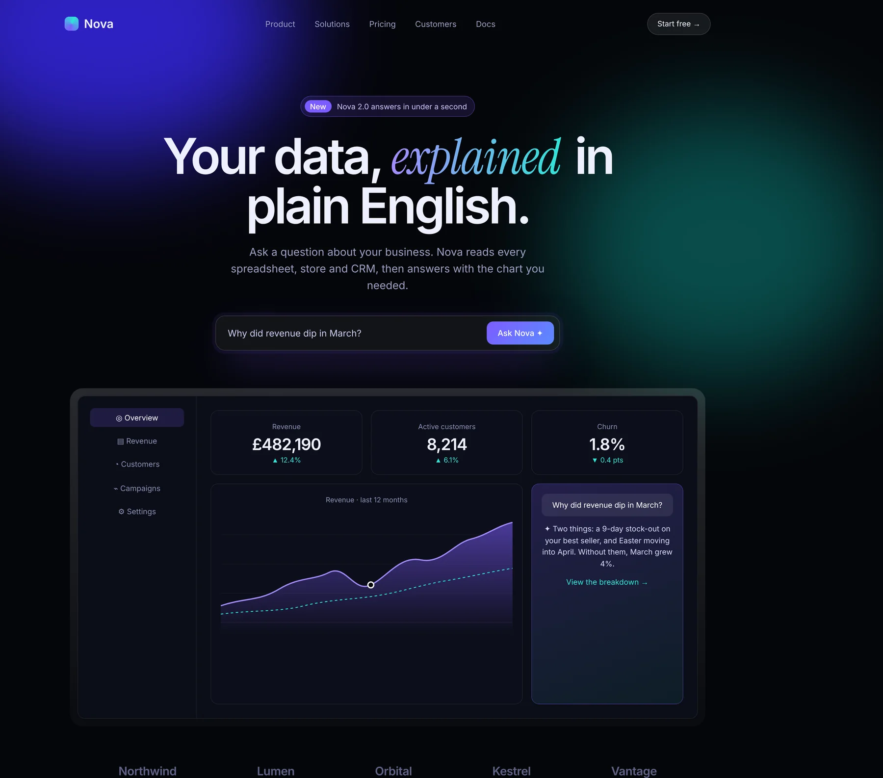
Nova
A data platform that answers business questions in plain English. It had to feel like the future, and still be easy.
Design decisions
- A violet-to-teal glow says “intelligent” without a single robot.
- The question bar is the hero: visitors try the product in their head instantly.
- A live dashboard proves it works before anyone reads a feature list.
[ 02 / Luxury watches ]
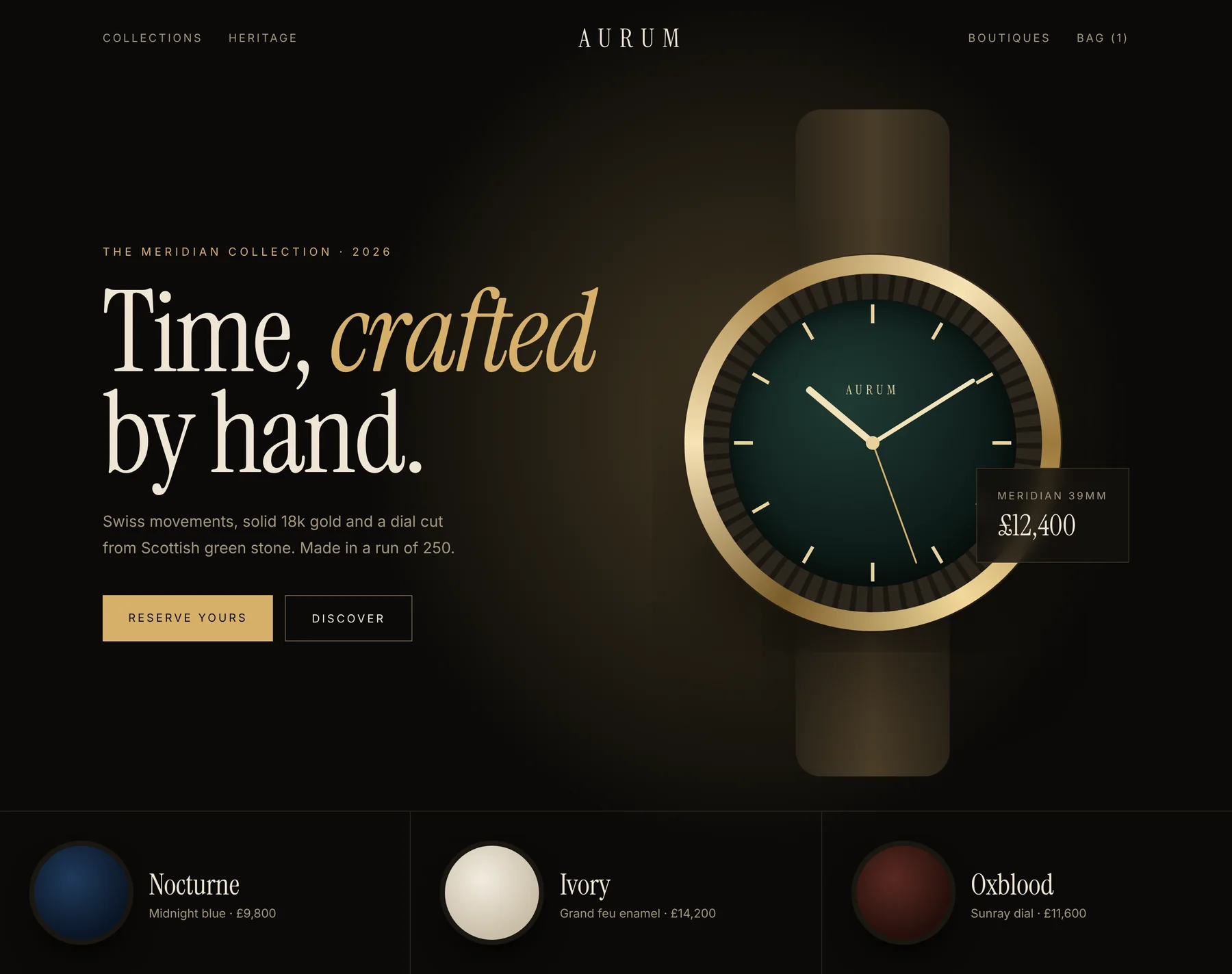
Aurum
A watchmaker selling a limited run of 250. Every pixel had to feel as precious as the product.
Design decisions
- Black and warm gold borrow the language of a jeweller’s window.
- A spotlight on one watch creates desire through scarcity and focus.
- The price sits quietly beside it: confidence, never a discount.
[ 03 / Ramen restaurant ]
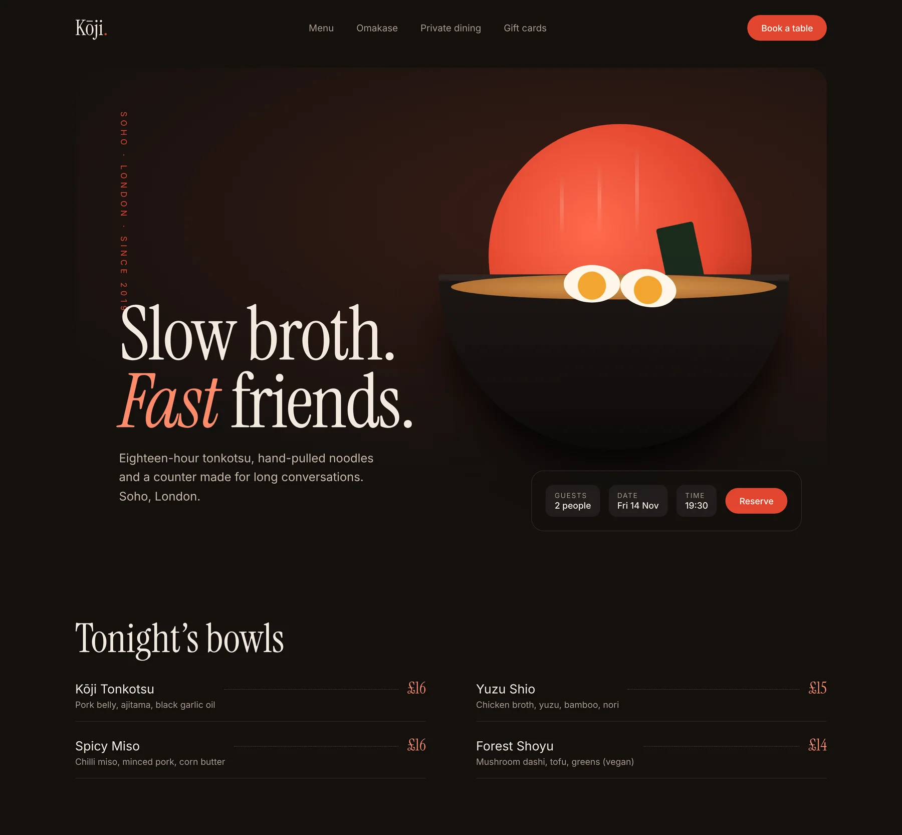
Kōji
A Soho ramen bar that wanted to fill its counter on weeknights.
Design decisions
- A rising-sun red and steaming bowl trigger appetite in under a second.
- Booking sits right in the hero: guests, date, time, done.
- Tonight’s menu with prices removes the last reason to hesitate.
[ 04 / Wealth management ]
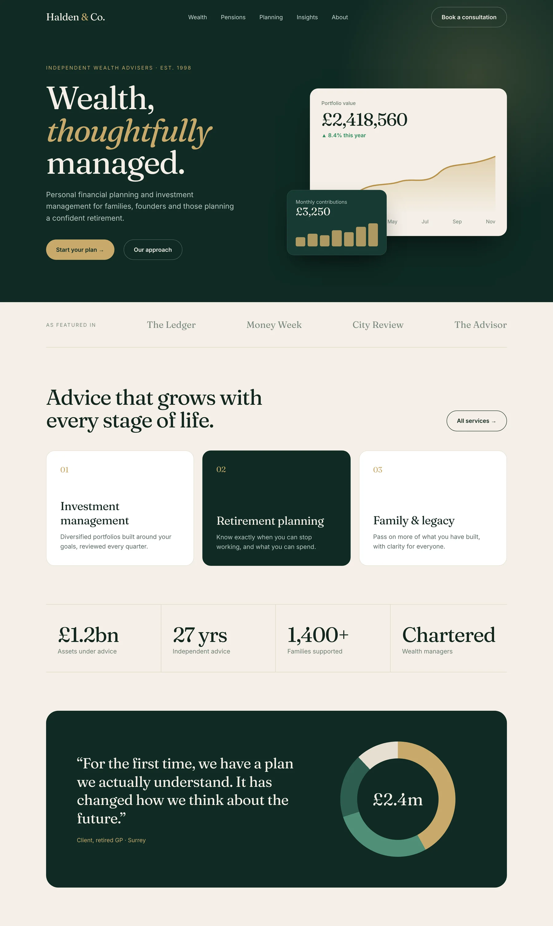
Halden & Co.
An independent wealth adviser that needed to feel established and calm, not salesy.
Design decisions
- Deep green and gold signal stability and old-fashioned trust.
- A live portfolio card shows the outcome before a word of sales copy.
- One gold button per screen: “Start your plan”.
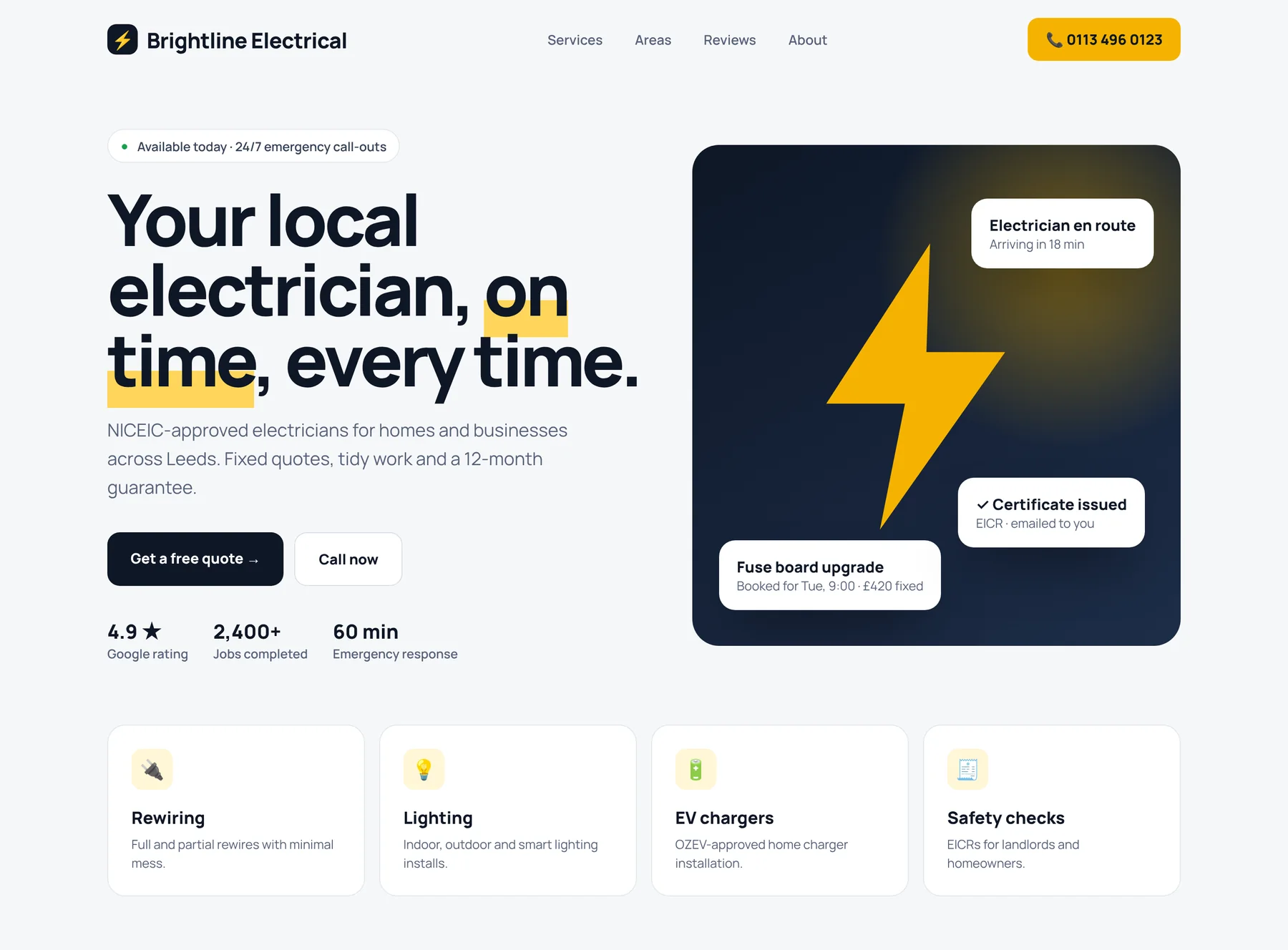
[ 05 / Electrician & trades ]
Brightline Electrical
A local electrician that wanted the phone to ring, not just more visitors.
Design decisions
- The phone number and “available today” sit in the first glance.
- Reviews, jobs completed and response time build trust instantly.
- Fixed-price examples remove the fear of a big bill.
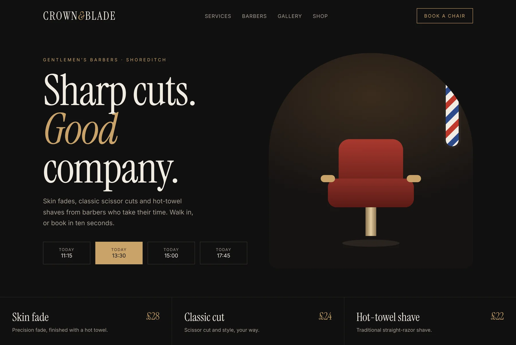
[ 06 / Barber shop ]
Crown & Blade
A barbershop that wanted fewer no-shows and more booked chairs.
Design decisions
- Dark wood and brass tones feel premium and grown-up.
- Today’s free slots in the hero make booking a single tap.
- Prices on the homepage: no awkward questions at the chair.
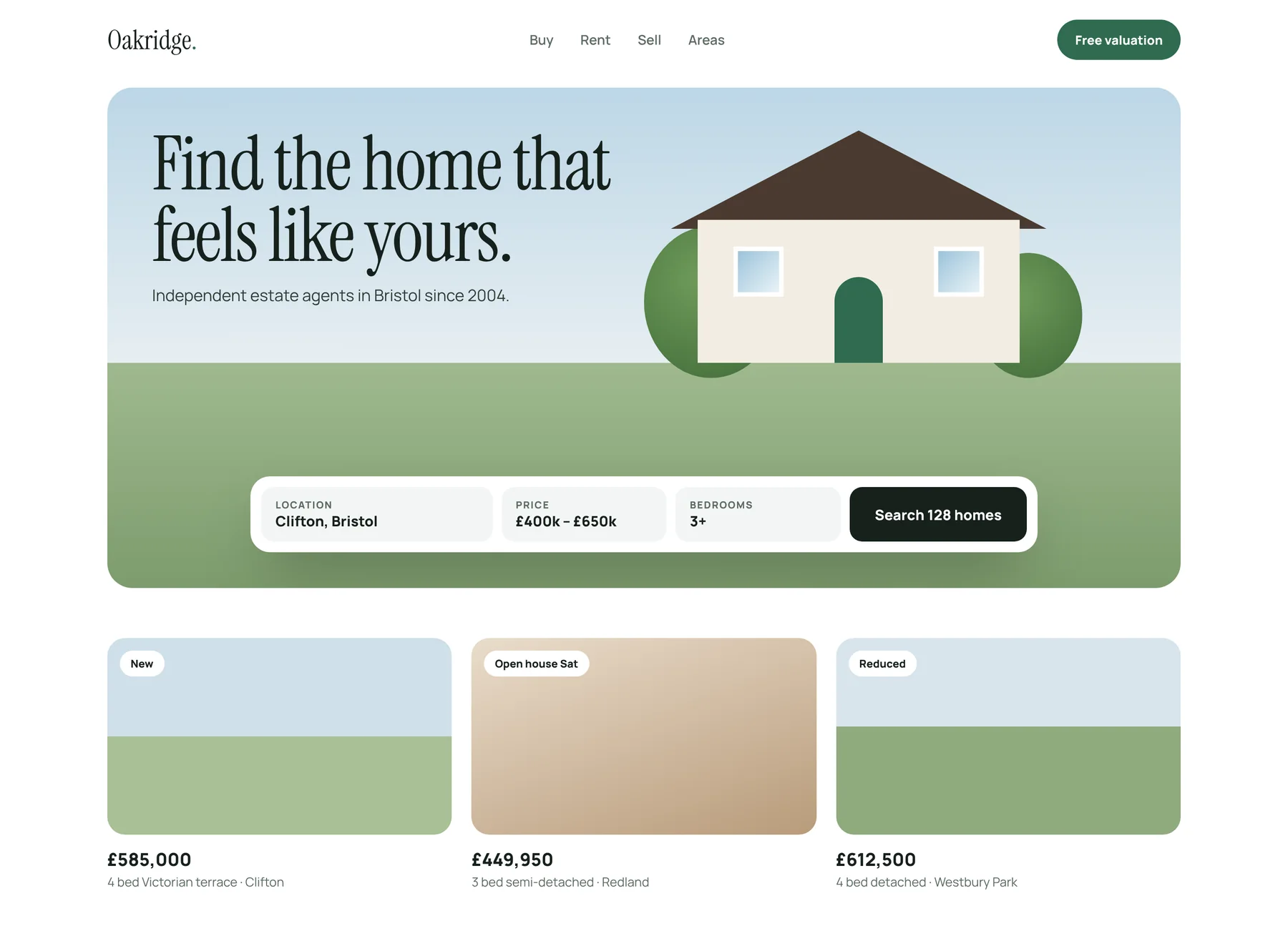
[ 07 / Estate agent ]
Oakridge
An independent estate agent competing with the big portals for sellers.
Design decisions
- A warm, sunny scene sells the feeling of home before the listings.
- Search sits right in the hero: location, price, bedrooms.
- “Free valuation” is always one click away to win sellers.
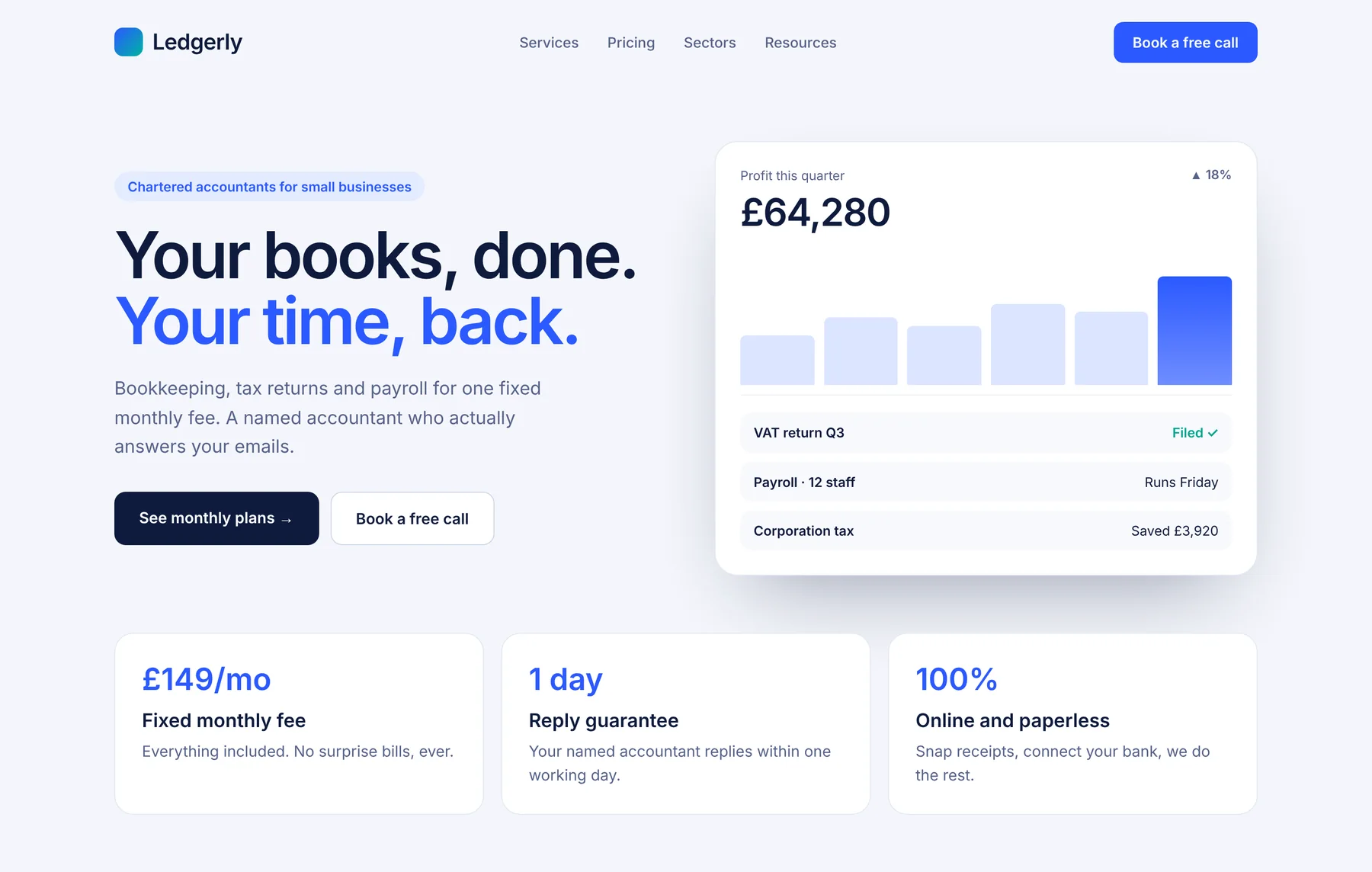
[ 08 / Accountants ]
Ledgerly
A modern accountancy firm selling fixed monthly plans to busy owners.
Design decisions
- Calm blues signal trust and competence, never stuffiness.
- A live dashboard shows the outcome: profit up, tax saved.
- The monthly price is upfront to beat “how much will this cost?”
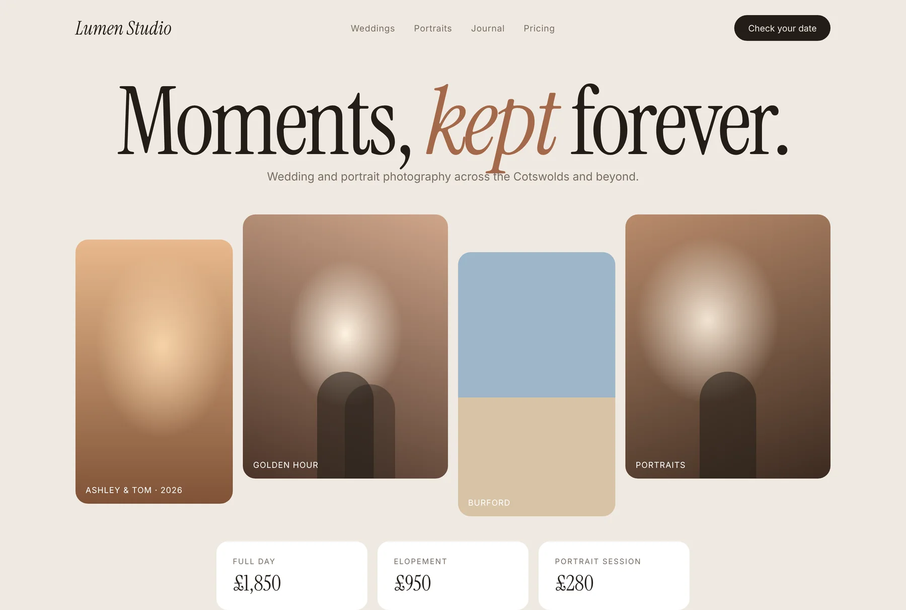
[ 09 / Wedding photographer ]
Lumen Studio
A wedding photographer whose site had to feel as emotional as the photos.
Design decisions
- Soft warm neutrals let the photographs carry every emotion.
- An oversized serif headline feels editorial, like a magazine.
- “Check your date” is the one action, because availability sells.
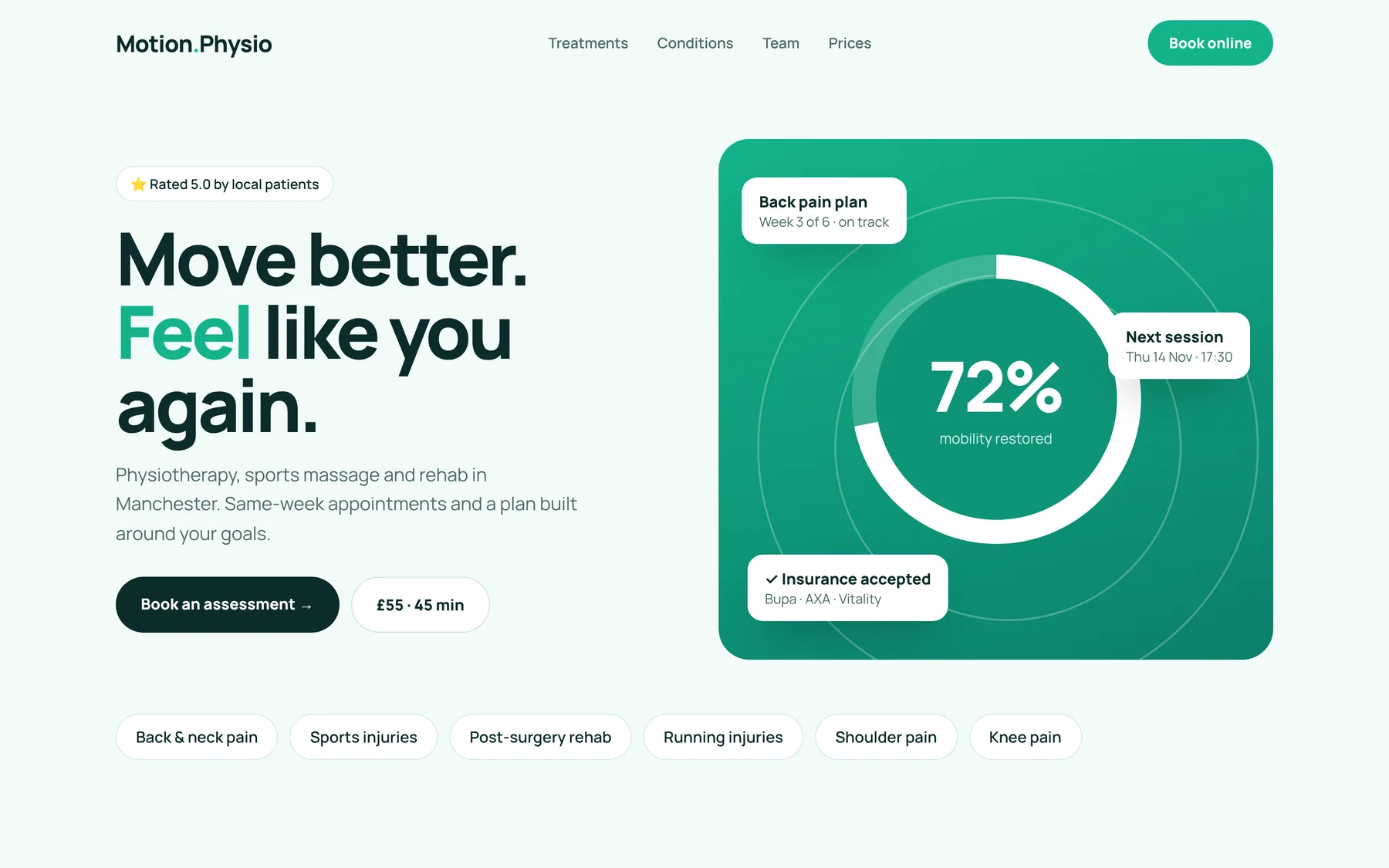
[ 10 / Physiotherapy clinic ]
Motion Physio
A physio clinic that wanted people in pain to book without hesitating.
Design decisions
- Fresh mint green feels healthy, calm and hopeful.
- Progress and next-session cards show what treatment feels like.
- Price and session length shown up front: no guesswork.
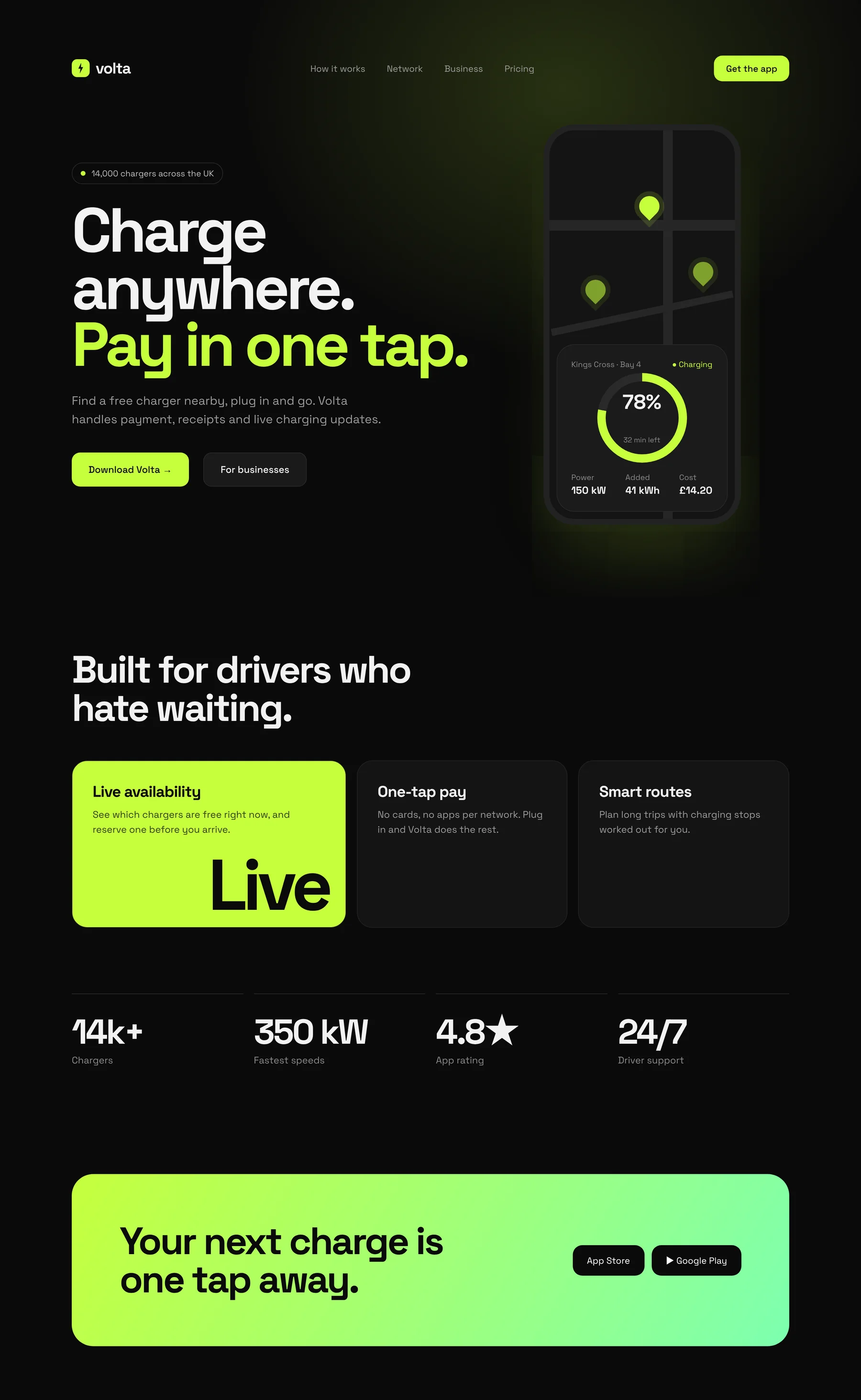
[ 11 / EV charging app ]
Volta
A charging app for drivers who hate waiting. Fast, confident, a little rebellious.
Design decisions
- Electric lime on black feels like energy, and is instantly ownable.
- The phone is the hero: the product sells itself in one glance.
- Two download buttons, nothing else to decide.
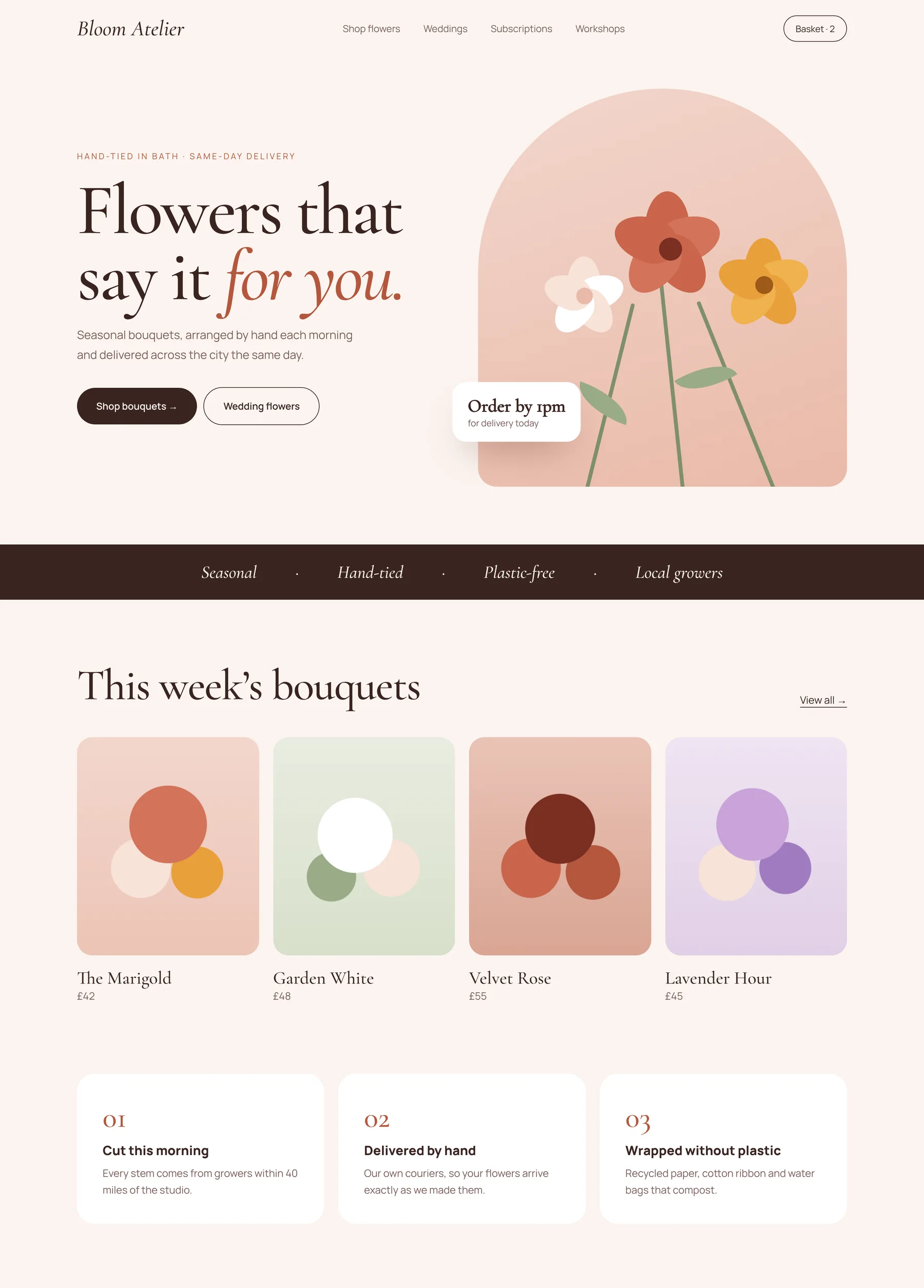
[ 12 / Florist & online shop ]
Bloom Atelier
A hand-tied florist that wanted online orders without losing its warmth.
Design decisions
- Soft blush and terracotta feel handmade and generous.
- “Order by 1pm, delivered today” answers the first question instantly.
- Bouquets priced up front to remove hesitation.
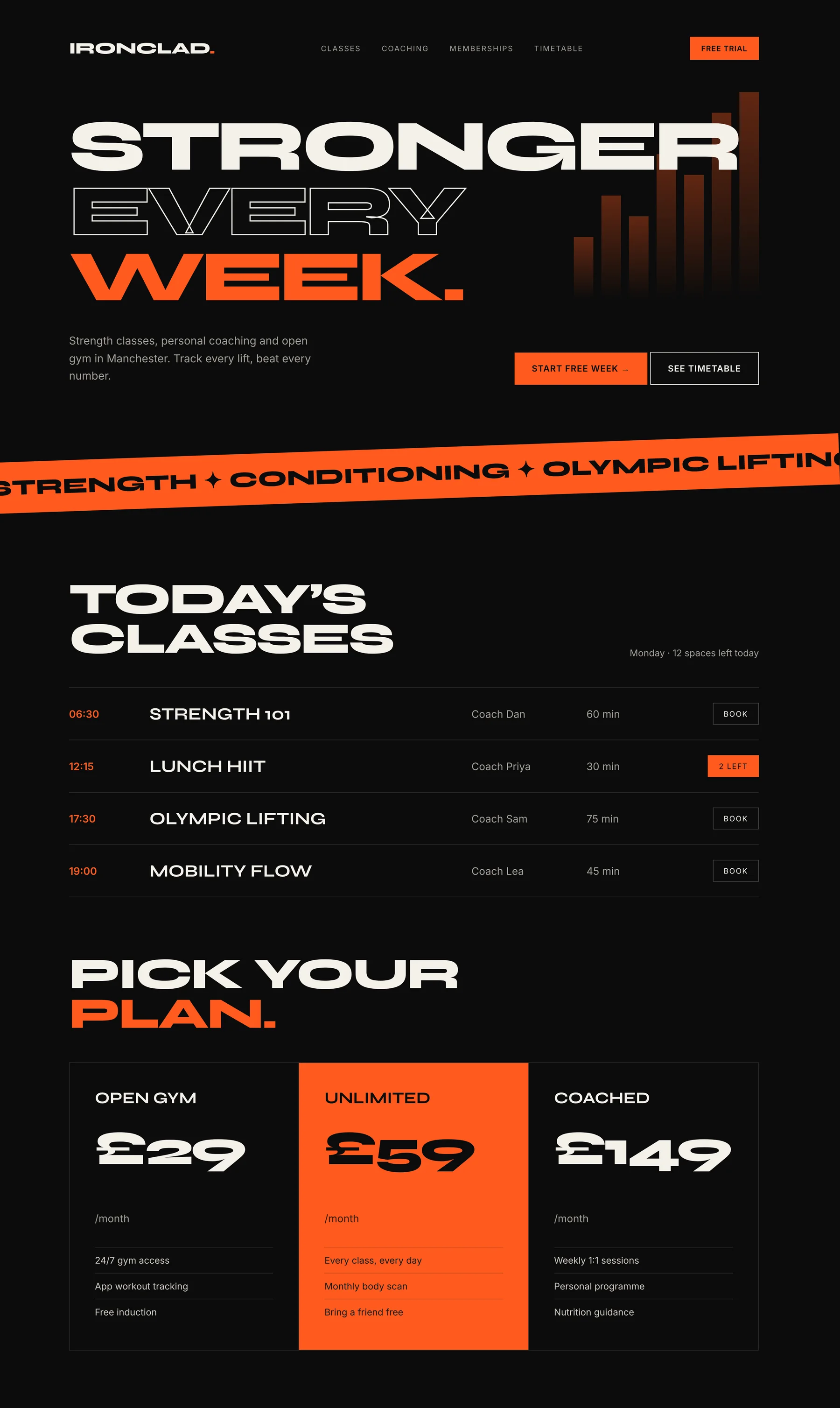
[ 13 / Gym & coaching ]
Ironclad
A strength gym that wanted to look as intense as its classes.
Design decisions
- Oversized type and orange create urgency and energy.
- Today’s timetable on the homepage turns browsers into bookers.
- A free week as the first step lowers the barrier to joining.
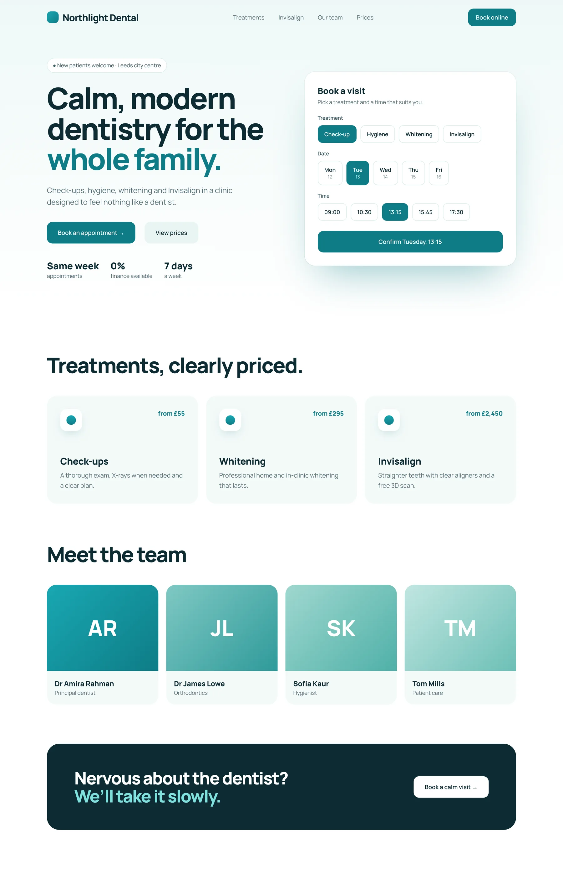
[ 14 / Dental clinic ]
Northlight Dental
A family dental clinic that wanted nervous patients to feel at ease.
Design decisions
- Clean teal and white feel clinical but kind.
- Booking happens right in the hero, in three taps.
- Prices and the team shown openly to build trust.
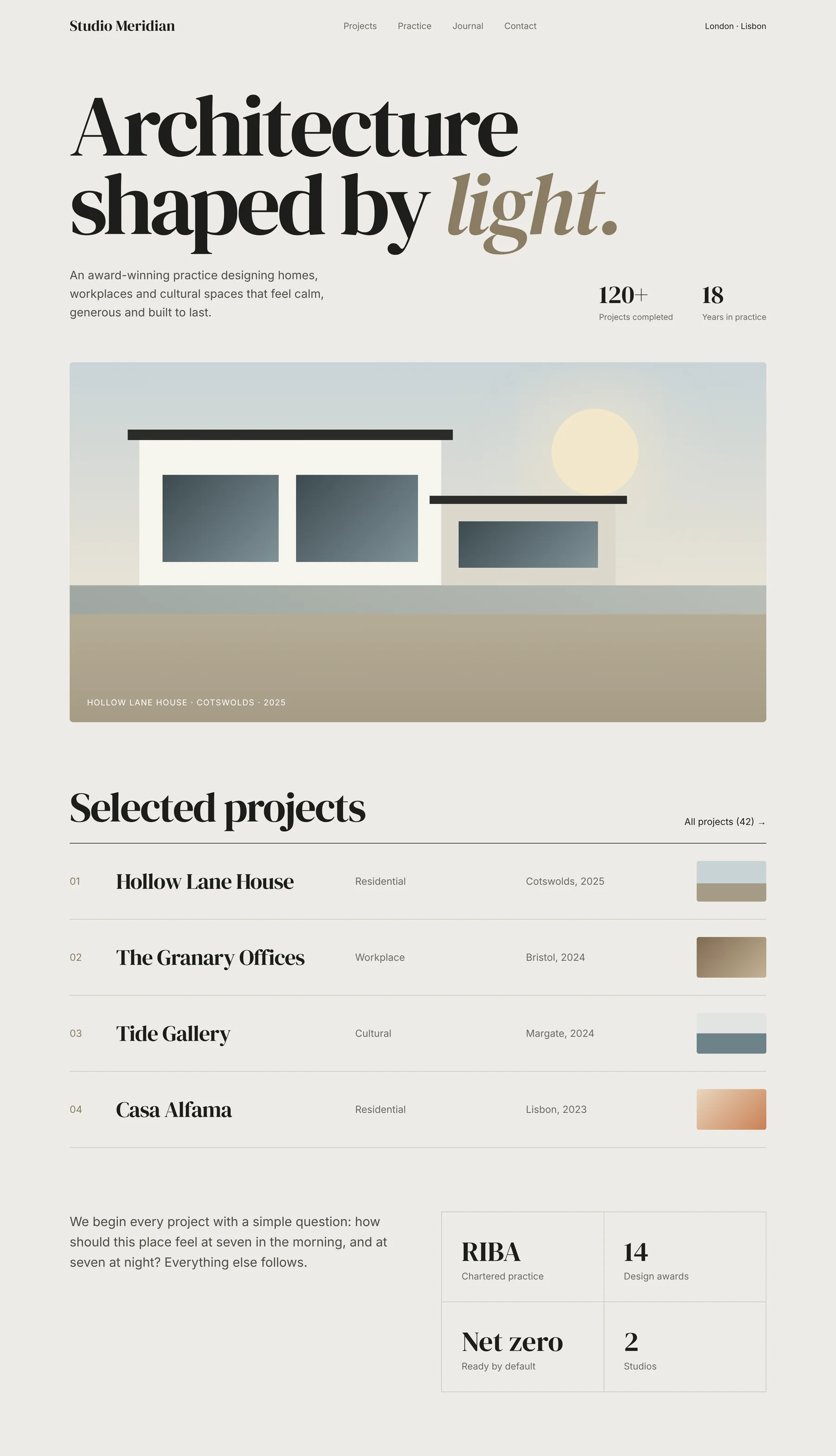
[ 15 / Architecture practice ]
Studio Meridian
An architecture practice whose work speaks quietly but carries weight.
Design decisions
- Stone tones and a serif let the projects lead.
- Projects listed like an index: confident, editorial, calm.
- No hard sell: the work is the pitch.
[ Next step ]
Let’s build yours.
Create your account, choose a package and pay securely. We start within one working day of your brief.